


How to write a product page that actually converts during sales season
 By Jamiek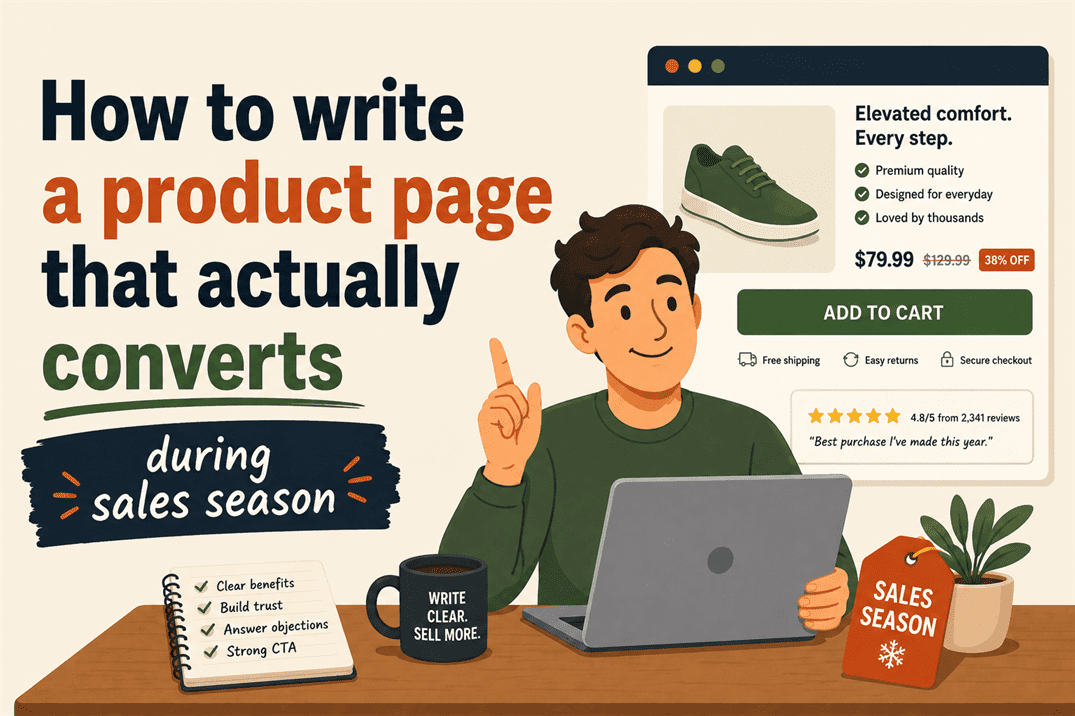
November is when product pages earn their keep, or don’t. Traffic goes up, attention spans go down and the gap between a page that converts and one that doesn’t gets wider and more expensive with every passing day.
The good news is that most underperforming product pages fail in predictable ways.
The fixes are less about creative inspiration and more about clear thinking applied in the right order.
With Black Friday and Christmas on the horizon, it’s more important than ever to get your product pages right.
Start with hierarchy, not enthusiasm
The most common mistake on a product page is leading with the wrong thing.
Not wrong in a catastrophic sense, just wrong in the sense of answering questions the reader hasn’t asked yet while leaving the ones they have asked hanging.
A reader arriving on a product page wants to know, in roughly this order:
- What is it
- What does it do for me
- Why should I trust that it does that
- What do I do next
That’s the hierarchy. Every element on the page should serve one of those four questions, and they should be answered in that sequence.
What usually happens instead is something like this:
“Introducing the BrewMaster Pro 3000. At Hendersons, we’ve been passionate about coffee since 1987, and our latest innovation represents the culmination of three decades of expertise in the art of the perfect brew.”
The reader wanted to know if it makes good coffee. They’ve now learned about Henderson’s origin story. They’ll now probably leave.
The version that works opens differently:
“A café-quality espresso at home, in under two minutes. The BrewMaster Pro 3000 uses fifteen-bar pressure and a commercial-grade portafilter to pull shots that taste like you know what you’re doing.”
Same product. Different order of information.
The reader now knows what it is, what it does, and implicitly, why they might want it.
The 1987 founding story can appear further down the page, where it functions as trust-building rather than obstruction.
Specificity is doing more work than you think
Vague copy feels safer to write. “Premium quality.” “Exceptional performance.” “Designed for the modern professional.”
These phrases contain no information, which means they can’t be wrong, which makes them feel like a reasonable hedge.
They’re not. They’re a signal to the reader that nobody’s thought very hard about what makes this product worth buying and they will act accordingly.
Specificity does two jobs at once: it informs and it persuades.
Consider the difference:
Vague: “Our running shoes offer superior comfort for long distances.”
Specific: “The cushioning compresses on impact and rebounds in 8 milliseconds, which means your legs feel less destroyed at mile eighteen than they did at mile ten.”
The second version tells you something. It’s also more persuasive, not because it’s trying harder, but because it’s committing to a claim.
Commitment reads as confidence. Confidence builds trust. Trust converts.
This applies to every element of the page. Instead of “fast delivery,” try “order before 2pm, delivered tomorrow.”
Instead of “highly rated,” try “4.8 stars across 1,400 reviews, with 94% recommending to a friend.”
Instead of “easy to use,” show someone using it in under a minute.
The specific version is always better. It’s also harder to write, which is why most pages don’t have it.
What urgency copy gets wrong
Urgency is a legitimate persuasion tool. Scarcity is real sometimes. Deadlines matter.
There’s nothing dishonest about telling a reader that a price goes up on Sunday.
The problem is synthetic urgency, the kind that arrives pre-loaded with countdown timers counting down to nothing in particular, stock warnings on products that are manifestly not running out and subject lines that have been in ALL CAPS since 2019.
Readers have spent years being exposed to this. They’ve developed a reasonably accurate filter for it, and when that filter fires, it doesn’t just neutralise the urgency cue, it actively reduces trust in everything around it.
The “only 3 left!” warning on a product that’s been showing “only 3 left!” for six weeks doesn’t create urgency. It creates the specific feeling of being handled, which is not a feeling that precedes a purchase.
Real urgency is specific and honest:
“Price goes back up to £89 on Monday 2nd December.” “We’re making 200 of these. When they’re gone, that’s it until February.”
“Order by December 18th for guaranteed Christmas delivery.”
These work because they’re verifiable and they treat the reader as a person capable of making a decision, rather than a pigeon that needs to be startled into clicking.
The trust layer most pages skip
Traffic during peak season includes a lot of people who’ve never heard of you.
They arrived via an ad, a referral, or a search, and they have no prior relationship with your brand.
The product page is doing the entire job of introduction and conversion simultaneously.
This is where social proof earns its place and where most pages either skip it entirely or use it badly.
Skipping it looks like, a product page with no reviews, no trust signals, no indication that anyone has bought this before and lived to tell the tale.
Using it badly looks like, a single quote from “Sarah, London” saying “Really happy with my purchase!” Sarah’s endorsement of her unnamed purchase tells the next reader nothing useful.
Using it well looks like, “I was sceptical because I’d tried three other standing desks and hated all of them. This one I’ve been using for eight months and my back pain is genuinely better. Assembly took forty minutes and the instructions were actually clear.”
That’s a real person describing a real experience with specific detail. It answers objections the reader has before they’ve articulated them.
The other trust layer that gets skipped is the return policy.
Put it on the page, near the buy button, in plain English. “Not right for you? Free returns within 30 days, no questions asked.”
That single line removes a significant amount of friction from the decision.
People don’t want to feel trapped. Telling them they’re not trapped makes them more likely to buy.
The buy button isn’t the finish line
The last thing worth fixing is the call to action, which on most product pages is either “Add to cart” or “Buy now,” sitting alone without any supporting context.
Both of those are fine as labels. Neither of them is doing any persuasive work.
The copy around the button is where the final nudge happens, and most pages leave it blank.
Compare:
[Add to cart]
With:
[Add to cart]
Free delivery on orders over £40. Arrives before the weekend. Free returns within 30 days.
The product hasn’t changed. The price hasn’t changed.
The friction has gone down and the confidence has gone up, which is what that moment in the page is supposed to do.
Sales season traffic is expensive to acquire and easy to lose.
A page that answers the right questions in the right order, commits to specific claims, uses urgency honestly and removes friction at the decision point will convert more of it than one that doesn’t.
None of that requires a redesign. Most of it requires a clear head and a willingness to say something specific.
If your product pages could use that kind of attention before November gets going, get in touch.
It’s usually less work than it sounds and the difference shows up quickly.

 Oct 13, 2026
